Shopping cart editing feature
In-app editing feature for TripAdvisor's attractions shopping cart, allowing users to modify their selections directly within the shopping cart.
Client: TripAdvisor
Role: Lead UX/UI Design
Duration: September – December 2017
To comply with my non-disclosure agreement, I have omitted and/or obstructed confidential information in the below case study. The featured data is my own and does not reflect the views of TripAdvisor.
background

The project was initiated to address a limitation in the attractions shopping experience on TripAdvisor. Because users were unable to edit product details directly from the shopping cart, it lead them to frustration, therefore cart abandonment and lost revenue. Our goal was to improve user engagement and conversion rates by enabling users to edit product specifics within the shopping cart.
My role
As the lead UX/UI designer, I contributed to the overall user experience strategy, by focusing on understanding user needs through user research, creating wireframes, and designing low-fidelity then high-fidelity prototypes. I collaborating closely with the product and the engineering teams, as well as the research team on testing, aligning design decisions with technical feasibility.
problem space

The objective of introducing the Edit functionality in the attractions shopping cart was to empower users to modify product details directly within the cart. This feature aimed to enhance user convenience and streamline the shopping experience by eliminating the need to remove chosen attraction and start the shopping process again. The goal was to increase attraction purchases by 10% and decrease cart abandonment rates by 7% to boost overall conversion rates and revenue. The feature was to be built for desktop and mobile platforms.
Pain points
The existing shopping cart experience had several user pain points. One major issue was the inability to modify product details directly from the cart. Users were frustrated with the need to remove items and go through the entire purchasing process again just to make essential changes like dates, tour grades, or PAX-mix (group size). This caused friction, disrupted the user flow, and led to a subpar experience. The goal was to address this pain point and provide a smoother shopping experience, enabling users to easily adjust attractions without unnecessary steps or repetition.
Research
The primary goal of the research, was to understand why users were abandoning their bookings and leaving items in their carts. However, in the process of conducting this research, we uncovered a notable user behavior patterns, regarding when bookings were typically completed. Many users added attractions to their shopping carts but abandoned them, only to return within a week or a few days leading up to their trip or even during the trip itself to make edits.
Understanding the motivations driving these edits was pivotal for enhancing the functionality of the shopping cart edit feature and ensuring a smooth user experience. Here are key findings of when the edits happened:
40% within a week to few days
These users typically consist of vacation planners who meticulously fine-tune their itineraries to ensure a well-organized and enjoyable experience. They often make adjustments to dates, tour grades, or PAX-mix based on their evolving preferences or availability.
30% during their trip itself
These individuals include families with children who may need to modify their plans due to unforeseen circumstances or changing interests. They rely on the flexibility of the shopping cart edit functionality to make on-the-go adjustments, ensuring a tailored and engaging experience for their family members.
30% very last minute changes
These users are spontaneous travelers who embrace the thrill of exploration. They are more likely to make last-minute changes to their attractions shopping cart, seeking new experiences and adapting their plans as they go. This segment values the convenience of easily modifying their selections, allowing them to take advantage of unexpected opportunities or recommendations from locals.
User personas
To better understand the diverse needs and preferences of our users, we have identified three distinct traveler personas. By understanding their needs and behaviors, we aimed to design a user experience that caters to their specific requirements.
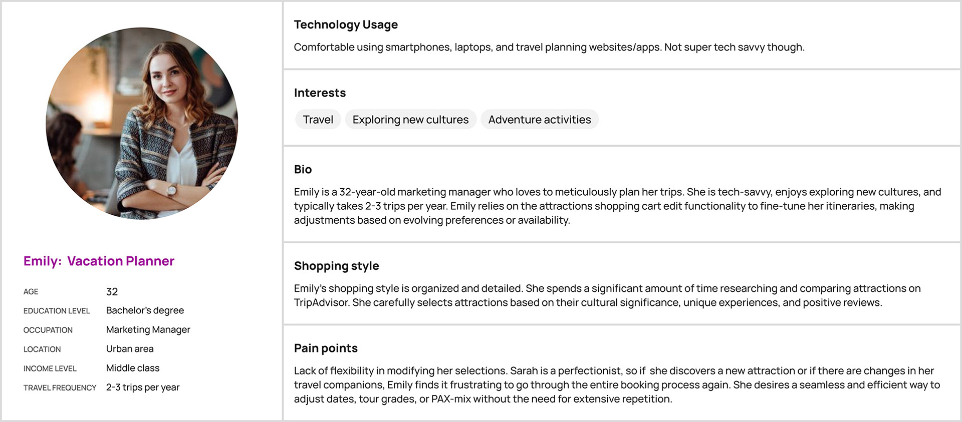
Emily: Vacation Planner
Emily is a 32-year-old marketing manager who meticulously plans her trips. She enjoys exploring new cultures and takes 2-3 trips per year. Emily relies on the attractions shopping cart edit functionality to fine-tune her itineraries, making adjustments based on evolving preferences or availability.
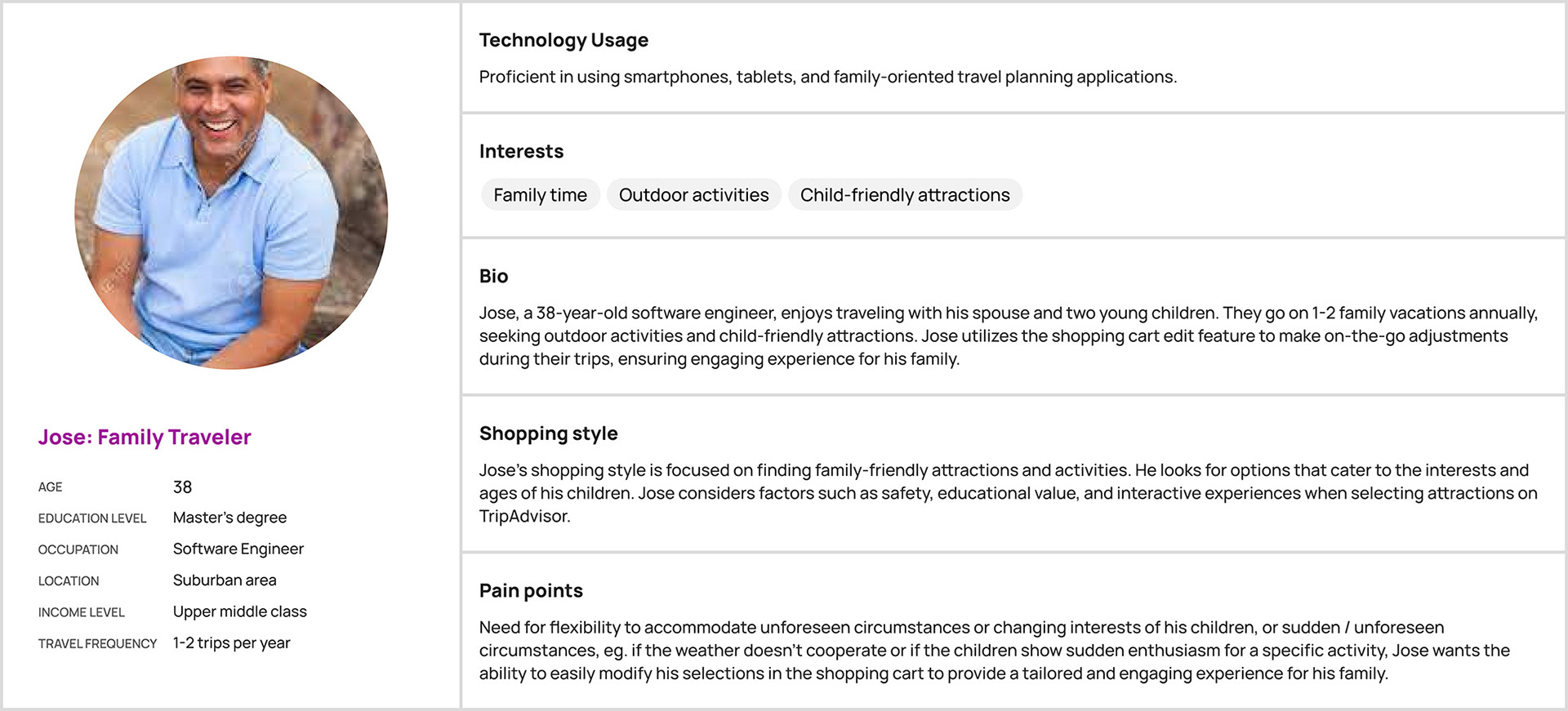
JOSE: Family Traveler
Jose is a 38-year-old software engineer who loves traveling with his spouse and two young children. They go on 1-2 family vacations annually, seeking outdoor activities and child-friendly attractions. Jose utilizes the shopping cart edit feature to make on-the-go adjustments during their trips, ensuring a tailored and engaging experience for his family.
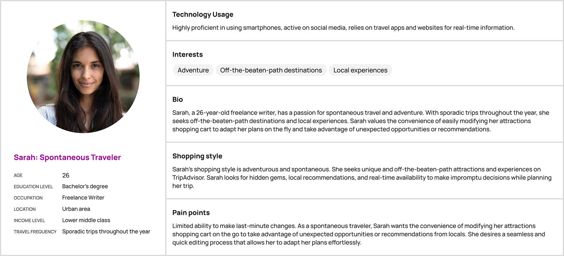
Sarah: Spontaneous Traveler
Sarah, a 26-year-old freelance writer, has a passion for spontaneous travel and adventure. With sporadic trips throughout the year, she seeks off-the-beaten-path destinations and local experiences. Sarah values the convenience of easily modifying her attractions shopping cart to adapt her plans on the fly and take advantage of unexpected opportunities or recommendations.
Design strategy

To create the most seamless user experience, the strategy was to test wireframes extensively, to ensure that the fundamental UX was established and evaluated. This way I was able to validate and refine the core functionality early in the process.
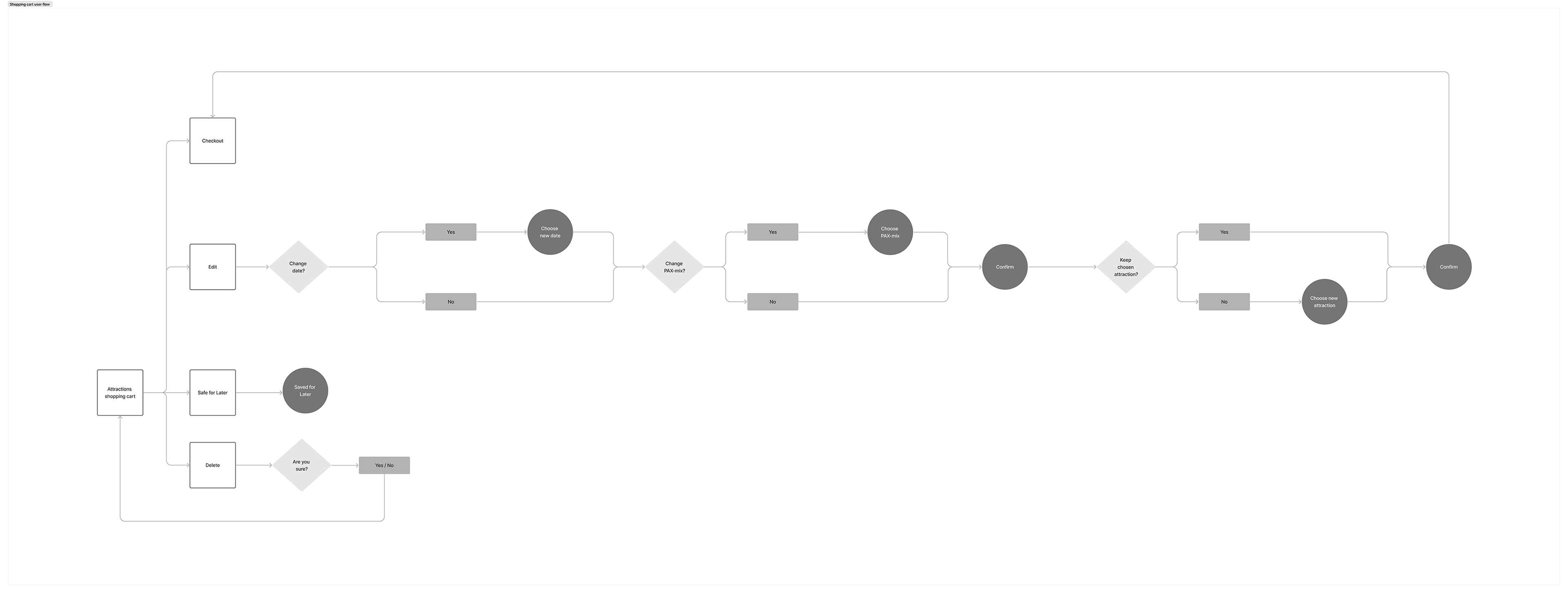
Flow charts
Through research and analysis, we assumed two distinct categories: one that was non-user dependent and another one that was. We mainly focused our design efforts on the latter one, user dependent use cases. The non-user dependent behavior, on the other hand, generally resulted in either completely deleting the attraction or making edits to it.
Furthermore, we expanded the shopping cart's functionality by introducing two new features: Safe for Later and Edit. The Safe for Later feature let users move items out of the cart for future consideration. The Edit functionality allowed users to modify their items in the cart, accommodating various types of edits and use cases.
Non-user dependent
• Past due: The selected item's date has already passed.
• No longer available: The attraction has been removed from the list.
• Overbooked: There are no more available spots for the chosen PAX-mix.
User dependent
• Change date
• Change PAX-mix
• Change attraction
• Change attraction tour grade
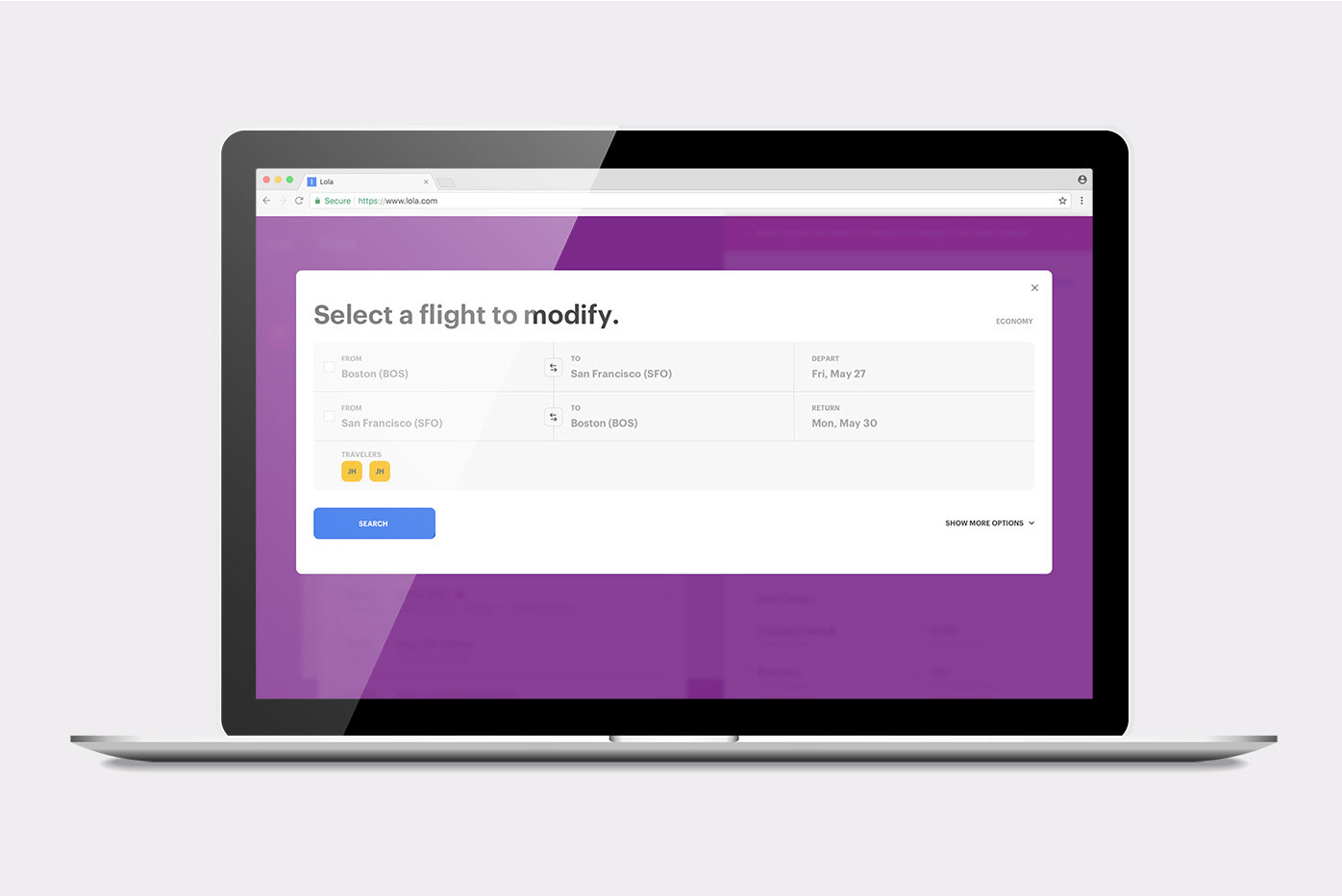
Wireframes
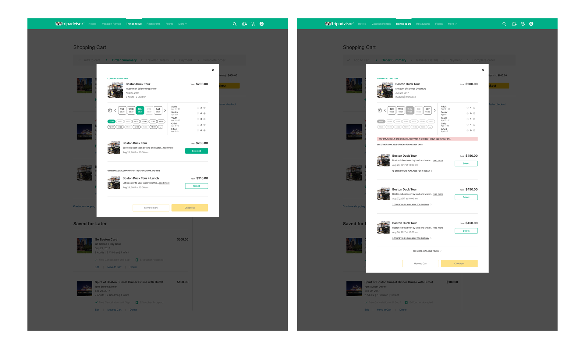
Based on the established user flows, I created wireframes focusing on a specific user dependent use case, which covered all the defined edits. These wireframes featured a tab-based component that allowed toggling between dates and PAX-mix options, allowing users to preview and modify their selections. The wireframes followed a three-step edit process, aiming for a clear and user-friendly experience. Extensive testing and user feedback were gathered to refine the wireframes before creating high-fidelity mockups. Below is one of the tested wireframes.
user flow: date Change
I left 2 tickets to the Cirque du Soleil in my cart for my husband and I, for August 28th. My husband can no longer go on that date, so I would only like to change the date to the following day or the next available date.
Step 1: Change date
Step 1: Change date
Step 2: Keep PAX-mix
Step 3: Choose ticket type
Step 4: Purchase tickets
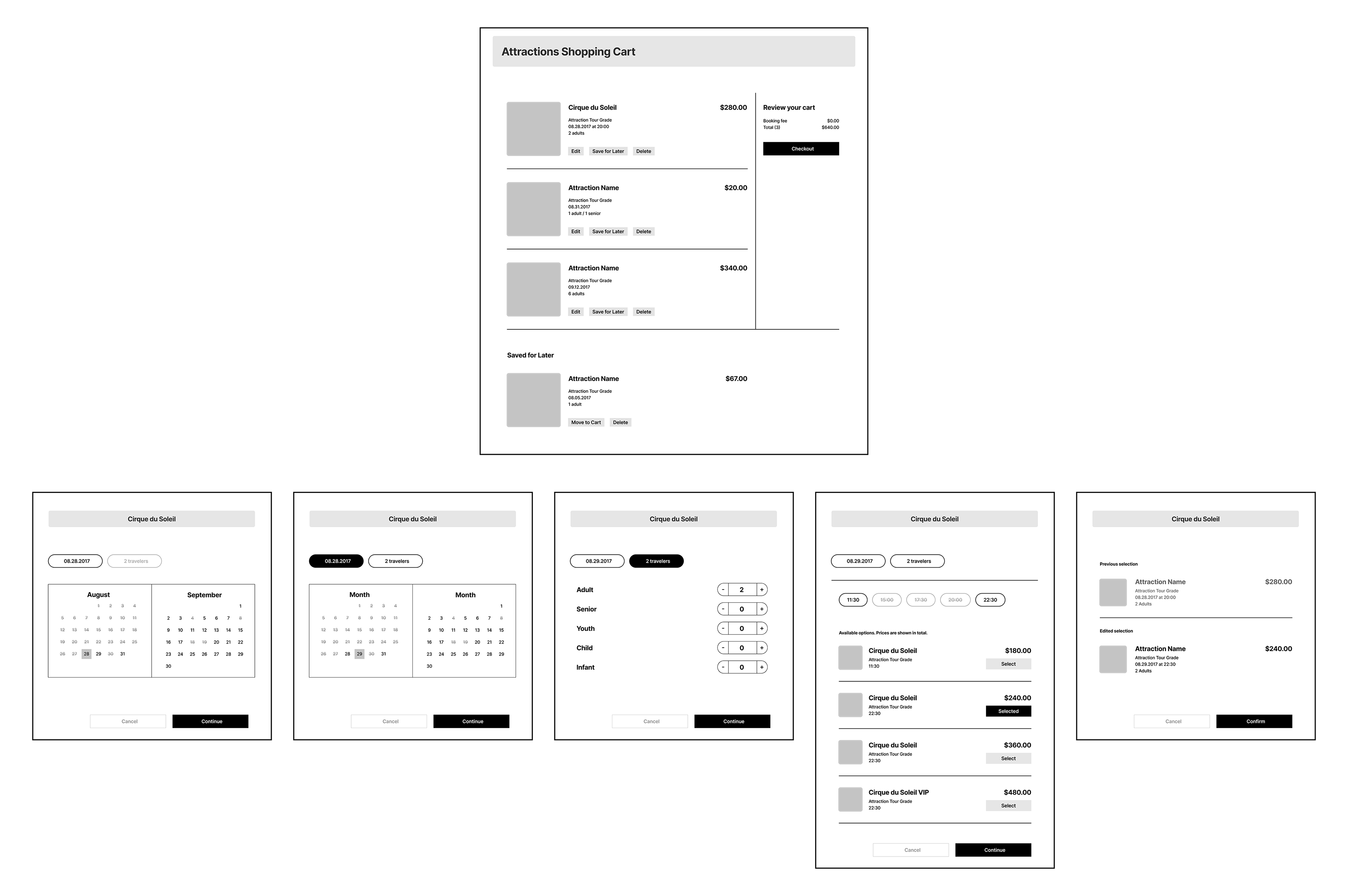
Testing
After conducting testing on the above wireframes and observing how users interacted with the date and PAX-mix selections, it became clear that they found it cumbersome to switch between tabs if previously chosen attraction wasn't available and vice versa for dates. This caused a lot of friction.
Another point I observed was that when changing date, the majority of testers opted for either the same date but with different time slots or chose a day or two before or after their initially desired date.
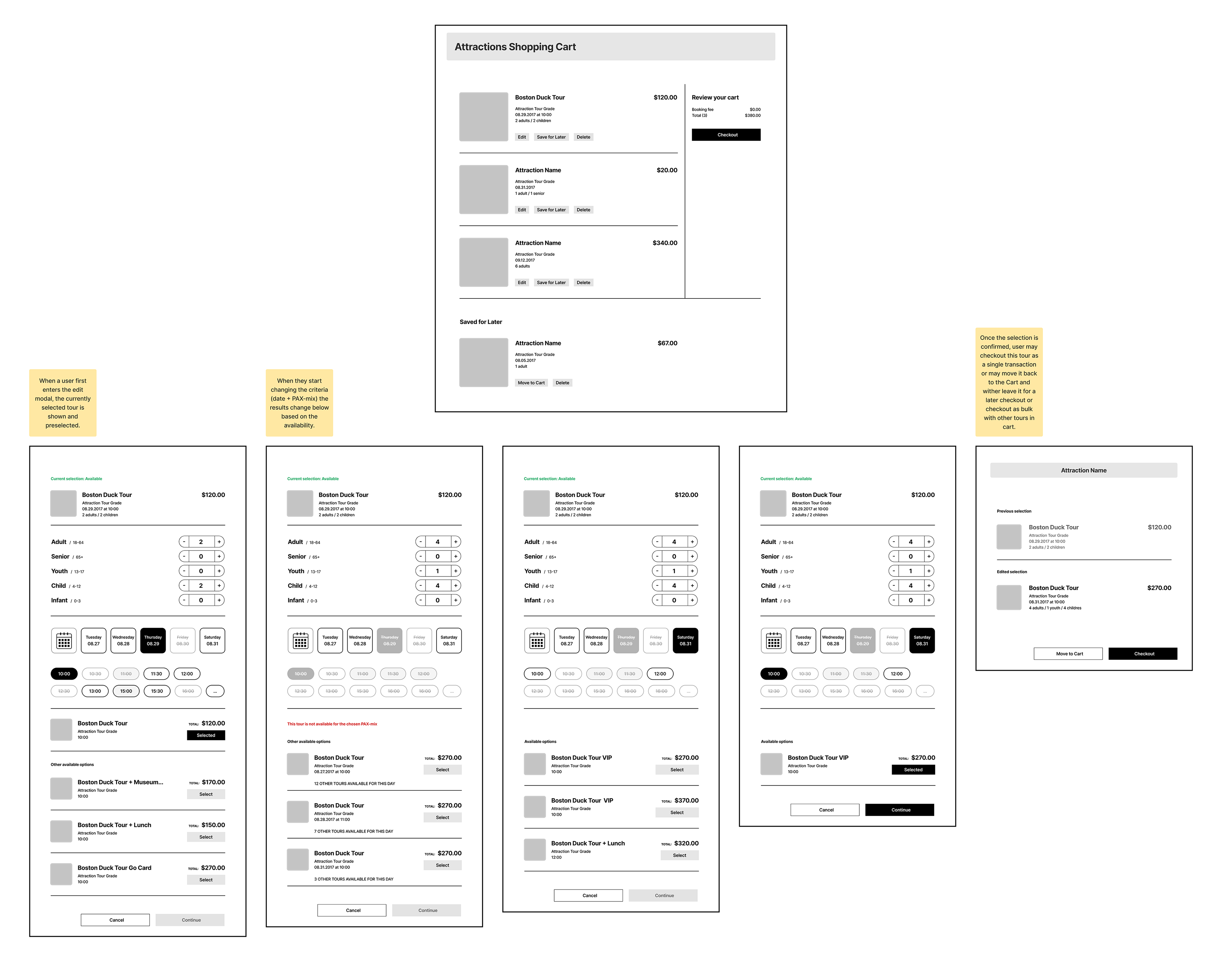
Revised wireframes
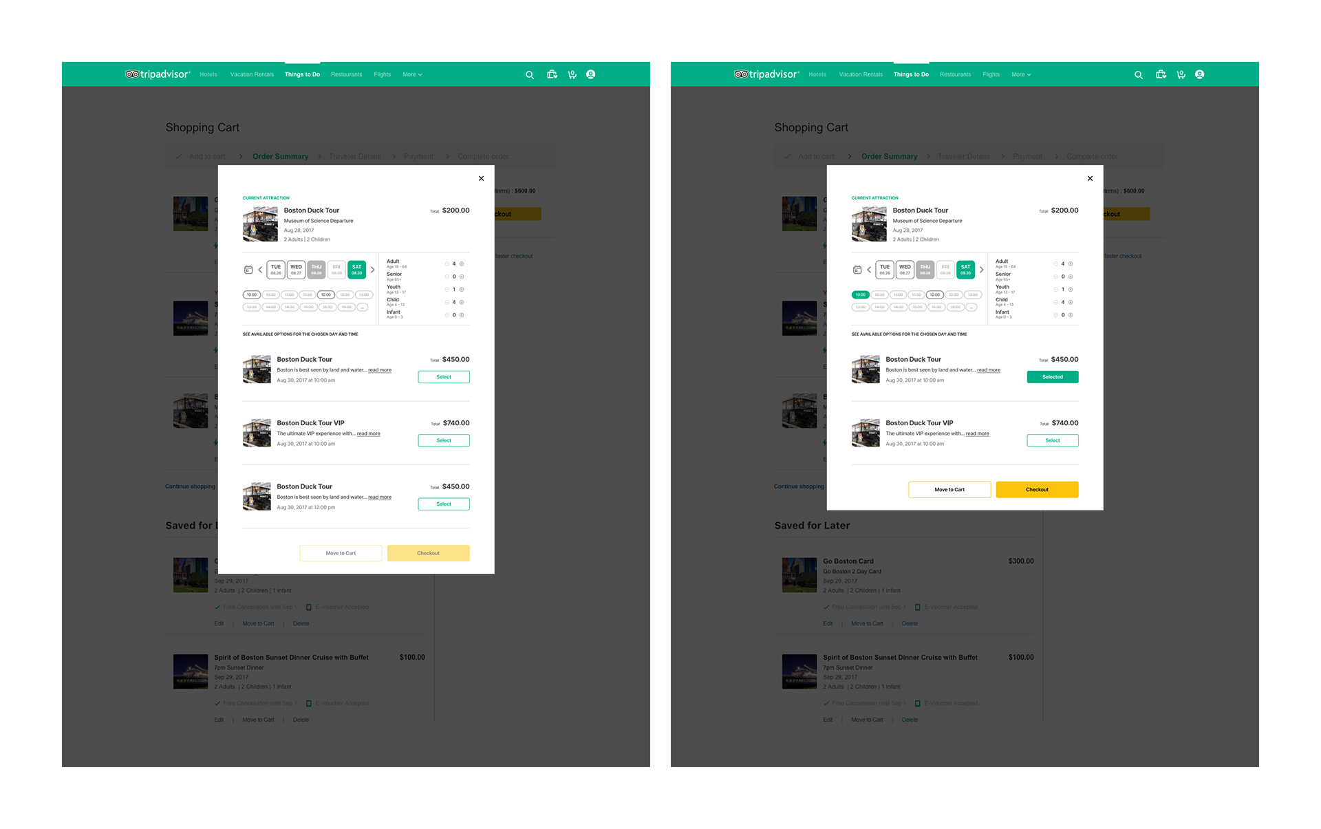
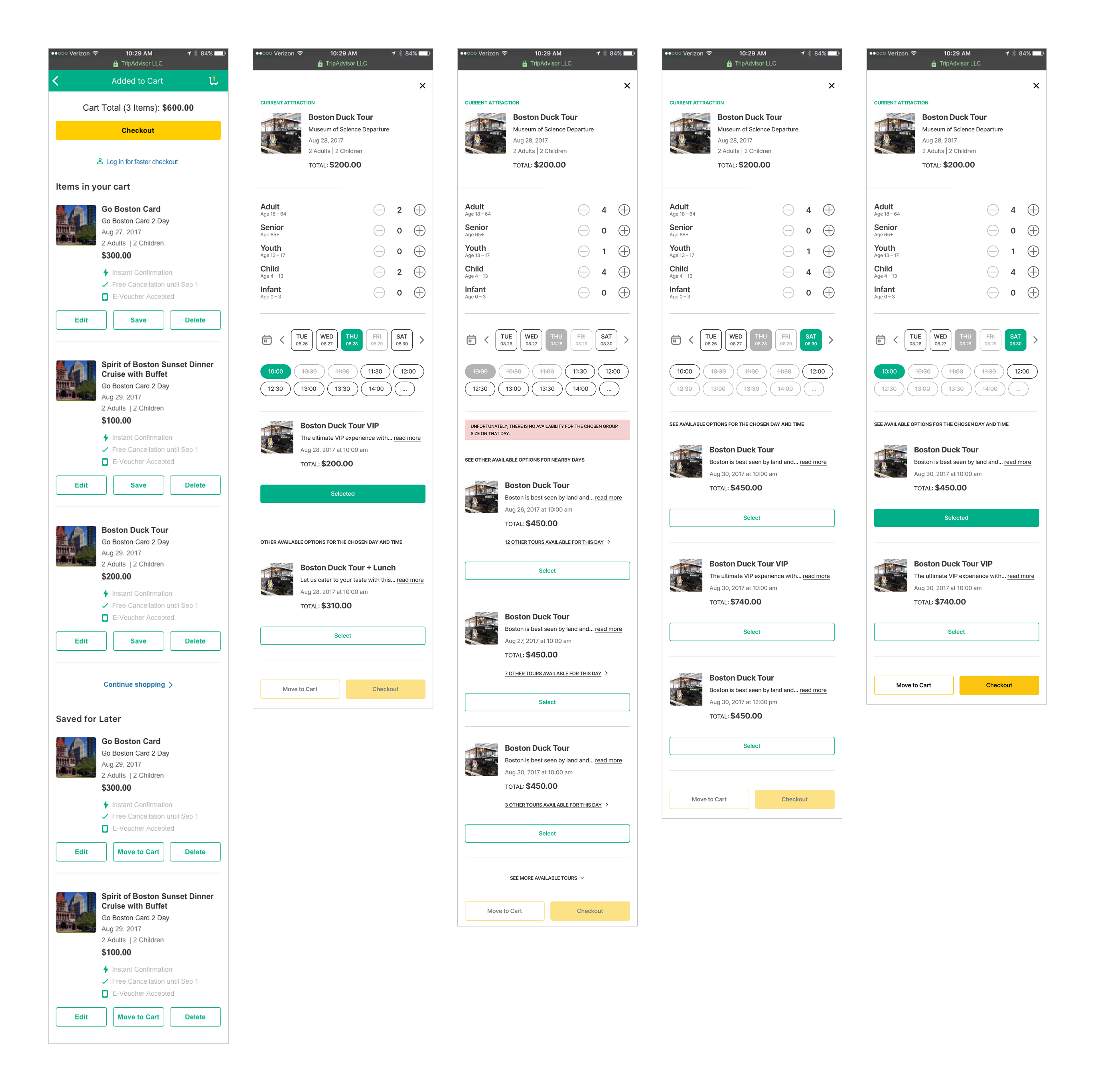
Once testing and synthesis was completed, the wireframes were refined to improve the user experience. One key enhancement was to remove the tab component in favor of a more seamless and intuitive flow. Additionally, the wireframes were adjusted to prominently display a five-day range, providing users with greater flexibility and convenience in selecting dates. As a result, the displayed results dynamically updated based on user selections, creating a more personalized and tailored experience.
CHANGE PAX-MIX
Few weeks ago I added 4 Boston Duck Tour tickets for August 29th for my wife and our 2 kids. I've just learned that my brother and his family will be joining us as well. Now that it’s getting closer to the date, I wanted to purchase tickets for all os us. We are flexible with dates, in case our large group can't be accommodated for the chosen date and time, but August 29th would be ideal.
Step 1: Change PAX-mix
Step 1: Change PAX-mix
Step 2: Check tour grade availability
Step 3: If necessary, adjust date
Step 4: Purchase tickets
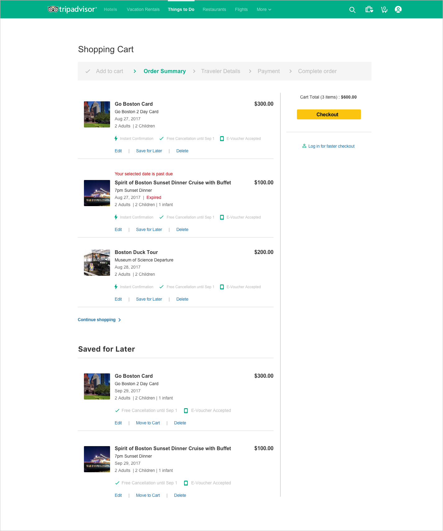
Prototype

Following wireframe testing, the team gained confidence in the chosen approach. I then transitioned to high-fidelity UI mockups for desktop, mobile web, and native app, adhering to consistent UX principles. The designs varied in scale to accommodate different screen sizes and platform-specific interactions, ensuring a cohesive and optimized user experience across devices and platforms.
desktop
The desktop version of the UI was contained within a modal. Not many layout changes were required between the high-fidelity mocks and wireframes, except for the placement of the date picker and PAX-mix selector and a few other small changes. The overall structure and flow of the design remained consistent, ensuring a seamless transition from the wireframes to the high-fidelity mocks. The focus of the adjustments was primarily on optimizing the placement and visibility of the date picker and PAX-mix selector, providing users with improved accessibility and ease of use within the modal interface.
mobile
In the mobile version the UX remained consistent with the desktop version, ensuring a seamless and familiar experience for users. However, the mobile design was optimized specifically for mobile devices, taking into account the unique characteristics and constraints of smaller screens. Both the UX and UI elements were carefully adjusted to enhance usability and ensure optimal functionality on mobile devices.
learnings

The Cart Edit feature successfully launched with outstanding results. Cart abandonments were nearly eliminated, and the conversion rate surged by 12% within the initial 3 months, surpassing the estimated increase by 2%. Subsequently, this feature was also integrated into the hotels pillar. Core insights gained from this experience include:
EMBRACE FAILURES
The initial concept of using tabs for navigating between dates and PAX-mix proved to be ineffective, which forced me to go back to the drawing board. This delay, although frustrating, provided a unique opportunity to enhance user understanding and ultimately produce an improved feature.
PIVOT
PIVOT
Continual discovery of new data and user behaviors during the research phase, prompted several course changes throughout the project, reshaping initial assumptions and guiding us toward unexplored avenues.
THINK GLOBALLY
THINK GLOBALLY
While the Cart Edit feature originated from TripAdvisor's Attractions team, its relevance extended to other product segments, such as hotels. This realization allowed us to adopt a global design approach, ensuring scalability of the feature and its widespread applicability.